Brief
Labatt is one of Canada's largest brewing companies, as major producers of several lines of beer sold across the country. With their incoming student program, the goal was to work with pre-existing brand assets to create a unique identity which would highlight the themes chosen for this year's program.
The following explores the development process of the brand and iterations of different theming.
Employment at Creative Currency
Tools Used Photoshop, Illustrator
Timeline 1 Week
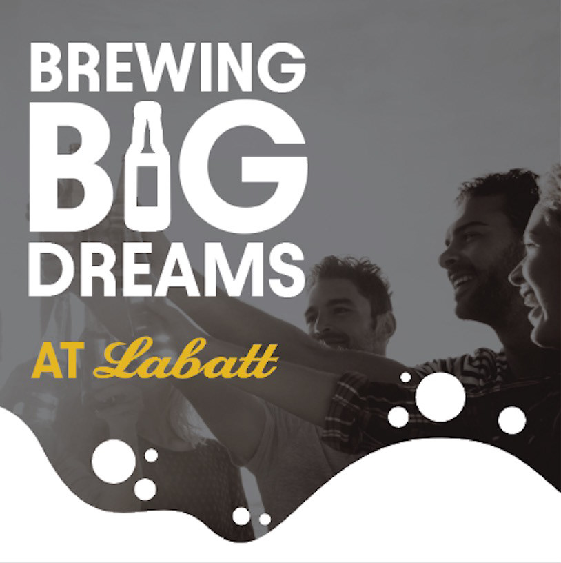
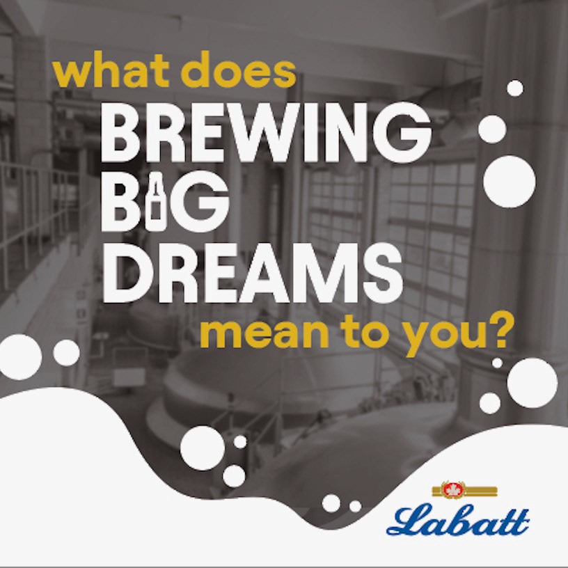
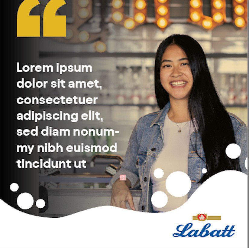
FIRST ITERATION
These first few iterations were a culmination of trying to strongly highlight the Labatt brand by implementing their colours and using their photography library to highlight the program.
SECOND ITERATION
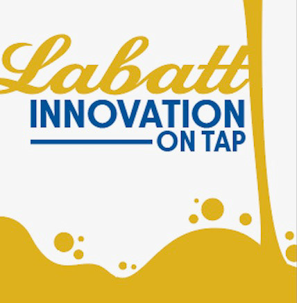
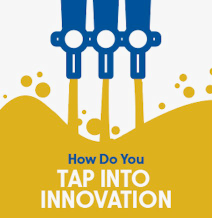
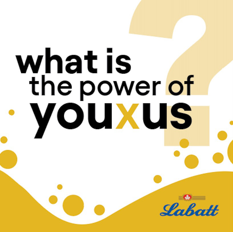
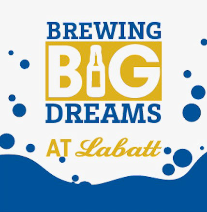
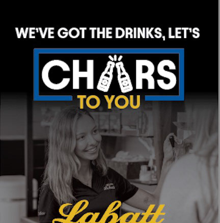
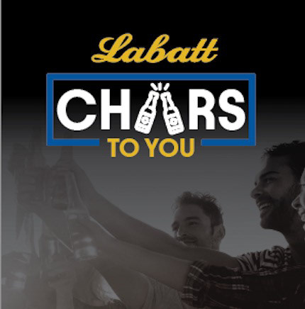
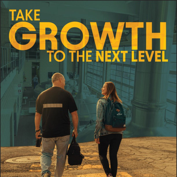
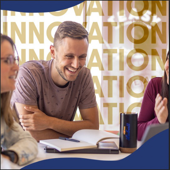
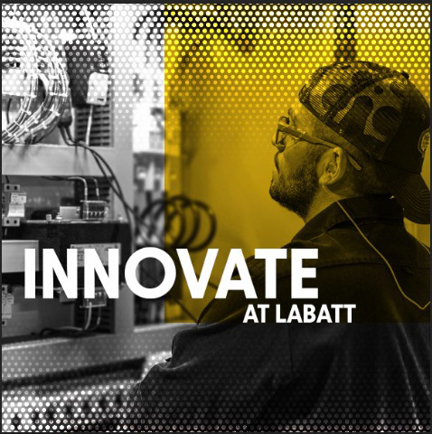
In this second iteration Labatt came back asking for more iconography as they were looking for something they could use to "brand" the program. They gave three main themes that we could go off of "Brewing Big Dreams", "Innovation on Tap" and "Cheers to you". Keeping these themes in mind, I did some research into how beer is made and thought about ways to implement beer into the graphics. After some experimentation, I came to the following results where the bubbly water became the main motif and while replacing common letters with beer bottles further solidified the theming.